


In Killer Design, I focused on redesigning prescription bottle labels to improve user safety and communication. Poorly designed labels can cause confusion, lead to improper medication use, and even result in life-threatening errors. I took on the challenge of reimagining these labels to ensure they present critical information clearly, promote proper usage, and prioritize user safety. Through this project, I demonstrated how thoughtful design can solve real-world problems and make a meaningful impact on people’s lives.
The Process


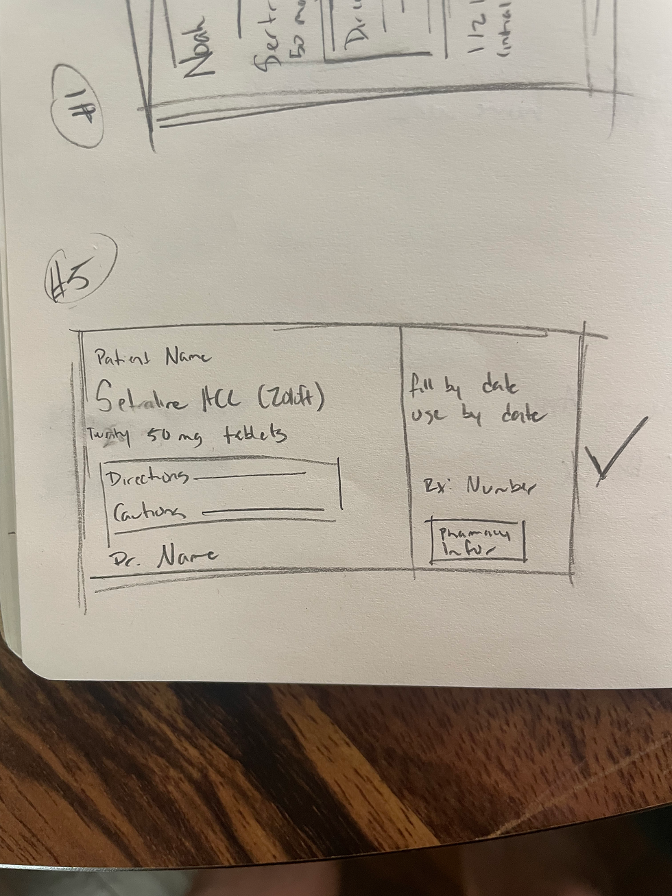

Sketches/Thinking
Throughout this project, I knew I wanted to focus on readability and clarity. I made the name of the medication the largest text on the bottle, and I also made it bold. I wanted it to be the most noticeable item on the label so a user could easily see what they were grabbing. Another big change I made was using sentence case throughout the design. I learned something interesting about the way we read. When we are scanning text, we are looking at the "shape" on the word. Each word has a different shape depending on what letters are in the word, but when words and placed in all caps, EACH WORD JUST LOOKS LIKE A BOX SO OUR BRAIN HAS TO DO EXTRA WORK TO DECIPHER EACH LETTER IN THE WORD. Lastly, I placed all the most important information for the user on the front of the label, and left information like the Rx# and pharmacy address on the back.
Word
WORD