


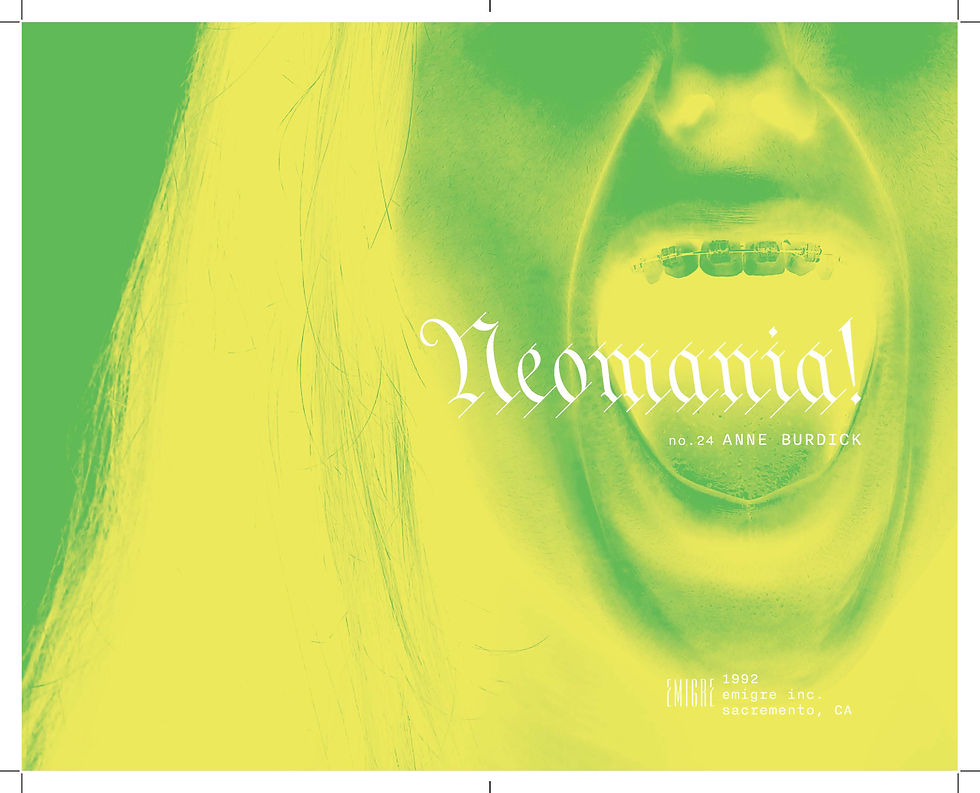
This project reimagines the essay Neomania by Anne Burdick, originally published in Emigre #24, as a mini booklet. I designed the cover, endpages, title page, and body copy layout. The concept behind my design explores the tension between the old and the new, reflecting the article's themes of fleeting trends and the constant pressure on designers to innovate. The cover combines blackletter type and ornate decorations—symbols of tradition—with the modern, clean Degular text to create a dynamic contrast. The title page illustrates a screaming mouth to evoke the anxiety and intensity Burdick describes when designers are forced to constantly reinvent themselves. The use of pink and green throughout the design represents clashing, sickly colors, emphasizing discomfort and the chaotic nature of trends. Overall, I aimed for the book to feel weird—intentionally unconventional—capturing the essence of Neomania and its critique of design culture’s obsession with the "new."
The Process


Type Trials
The first part of this project was finding the right body copy font. I needed a font that had special characters, superscript, subscript, and small caps. After I printed out a few of these type trials, I landed on the font degular with font size 9.5 and a leading of 13.


The Title Page
Next, I started by exploring two different options for the title page. One used Futura and was clean and minimal, the other direction featured the screaming mouth and utilized a blackletter typeface. In the second iteration of these, I added some color to option 1 and tightened up the layout. For option 2, I inverted the color overlay to increase legibility. I moved forward with option 2 because it felt true to the emotions I experienced reading Neomania, and gave me an exciting starting point when I began exploring the cover design.


The Cover
In my initial sketch, I knew I wanted to use the spine as a way to pull the reader around the back. From there, I brought in the typeface from the title page and started to explore how to make the front cover ornate. I messed around with patterns and colors until I found the right combination. I also knew I wanted to include some type of weird imagery on the cover to help tie in the title page scream, and I stumbled upon these weird, amazing portraits on unsplash. I needed to use them. I changed the text over these images to pink to increase readability, but I kept the line length unconventional to force people to really have to pay attention and read what that quote is.