DESK ARREST

DESK ARREST

Photography

Art Direction

Zine

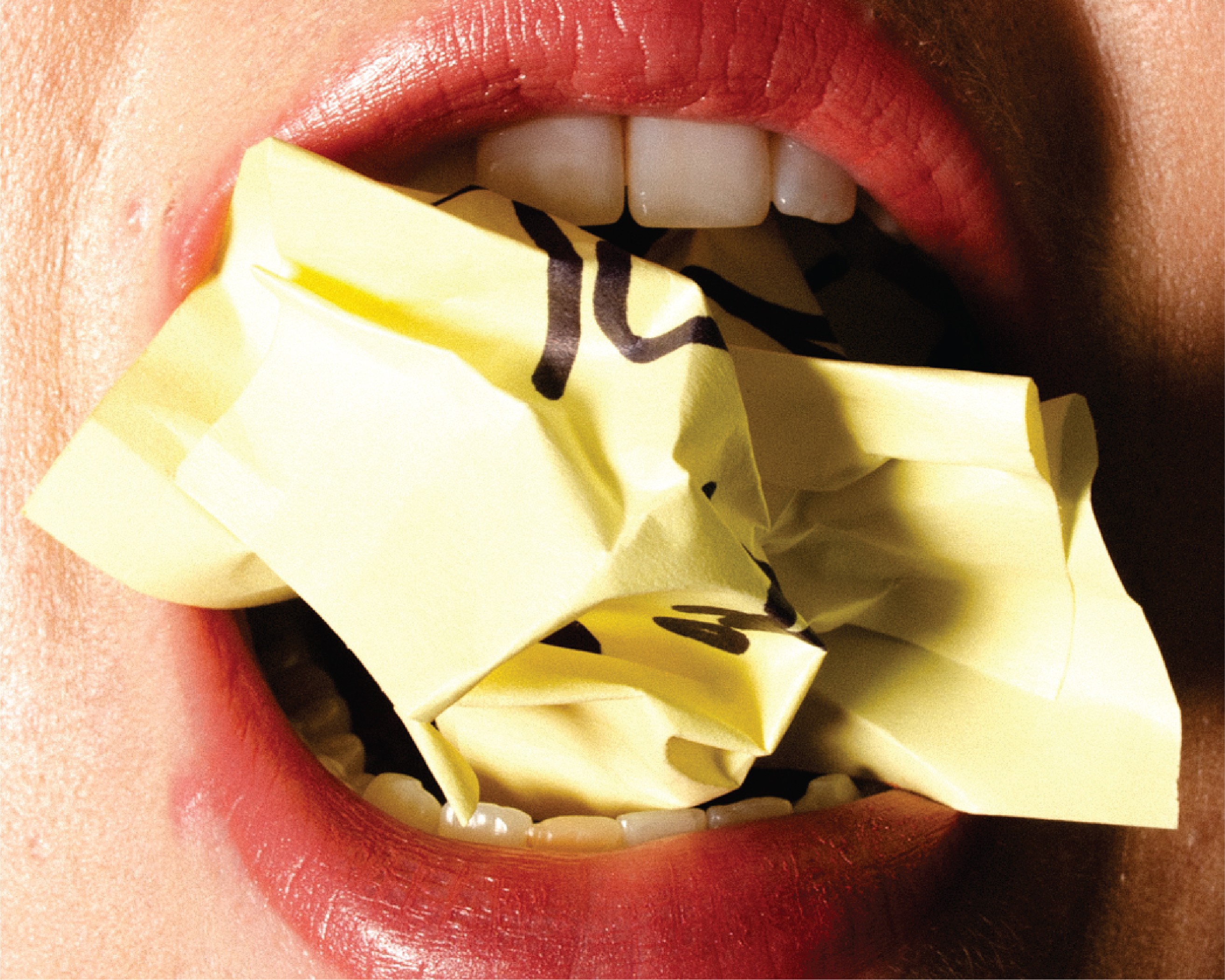
I developed GLITCH magazine’s Desk Arrest campaign, showcasing OMNES’s Winter 2024 eco-conscious office wear line. This photo campaign reimagines the modern workplace as a Y2K-inspired prison, blending sharp tailoring with surreal, office-themed imagery to critique the soul-crushing monotony of 9-to-5 culture. The campaign captures models trapped in office props juxtaposed with OMNES’s bold, sustainable designs. These visuals embrace GLITCH’s signature edgy, anti-establishment tone, resonating with a Gen Z audience that rejects rigid societal norms.

I developed GLITCH magazine’s Desk Arrest campaign, showcasing OMNES’s Winter 2024 eco-conscious office wear line. This photo campaign reimagines the modern workplace as a Y2K-inspired prison, blending sharp tailoring with surreal, office-themed imagery to critique the soul-crushing monotony of 9-to-5 culture. The campaign captures models trapped in office props juxtaposed with OMNES’s bold, sustainable designs. These visuals embrace GLITCH’s signature edgy, anti-establishment tone, resonating with a Gen Z audience that rejects rigid societal norms.

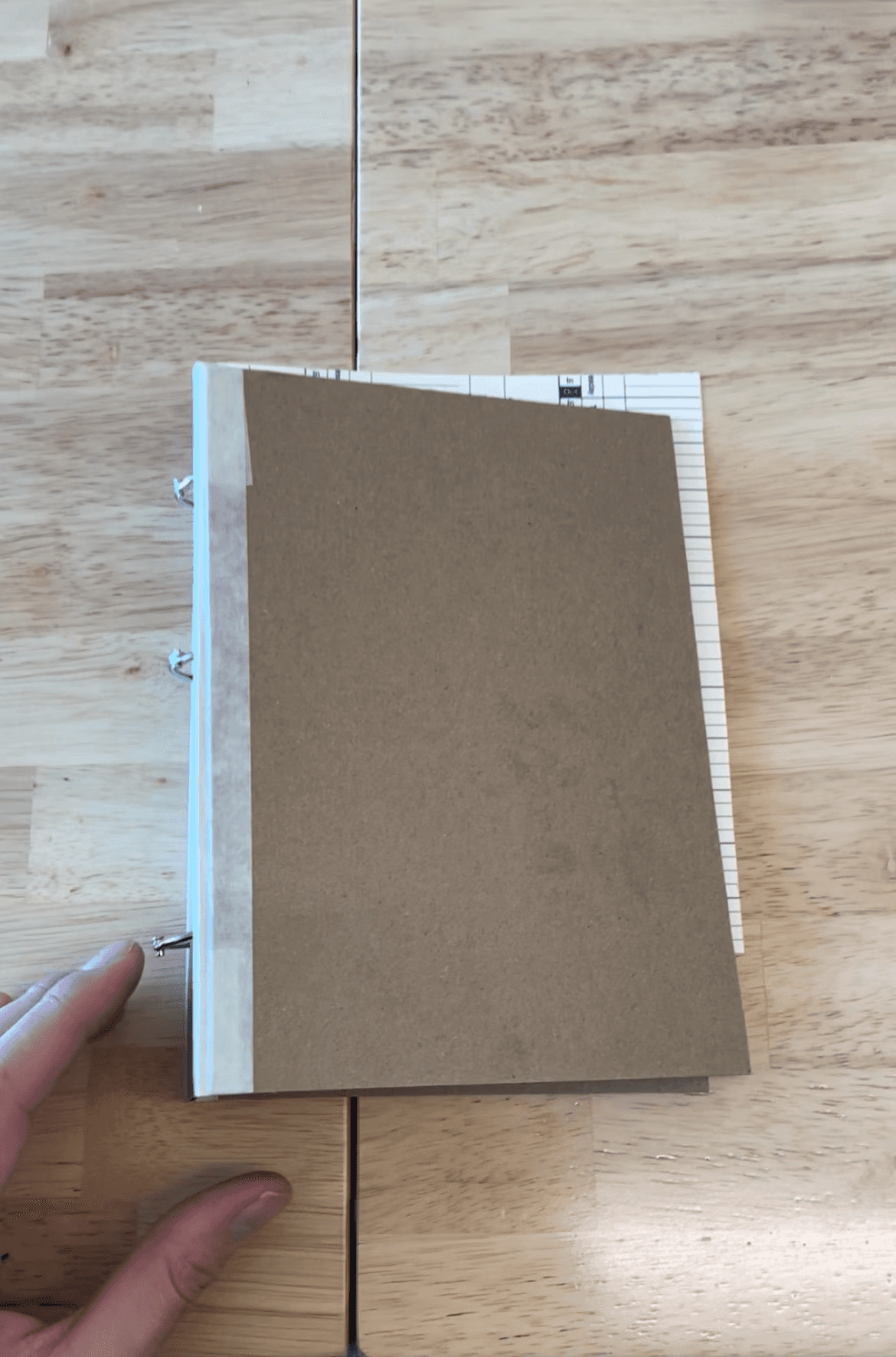
To present the spread, I designed handmade binders and notebooks that extended the office narrative beyond the imagery. Using office-style production techniques, I printed elements on sticky notes and manila paper, transforming everyday workplace materials into part of the Desk Arrest concept. I also screen-printed pieces like the covers and time cards, reinforcing the hands-on, institutional feel. Styled after police reports, these tactile elements created a cohesive, immersive presentation that amplified the campaign’s rebellious take on modern office wear.

To present the spread, I designed handmade binders and notebooks that extended the office narrative beyond the imagery. Using office-style production techniques, I printed elements on sticky notes and manila paper, transforming everyday workplace materials into part of the Desk Arrest concept. I also screen-printed pieces like the covers and time cards, reinforcing the hands-on, institutional feel. Styled after police reports, these tactile elements created a cohesive, immersive presentation that amplified the campaign’s rebellious take on modern office wear.

The Zine

The Photos

THE PROCESS

Brainstorming/Sketches

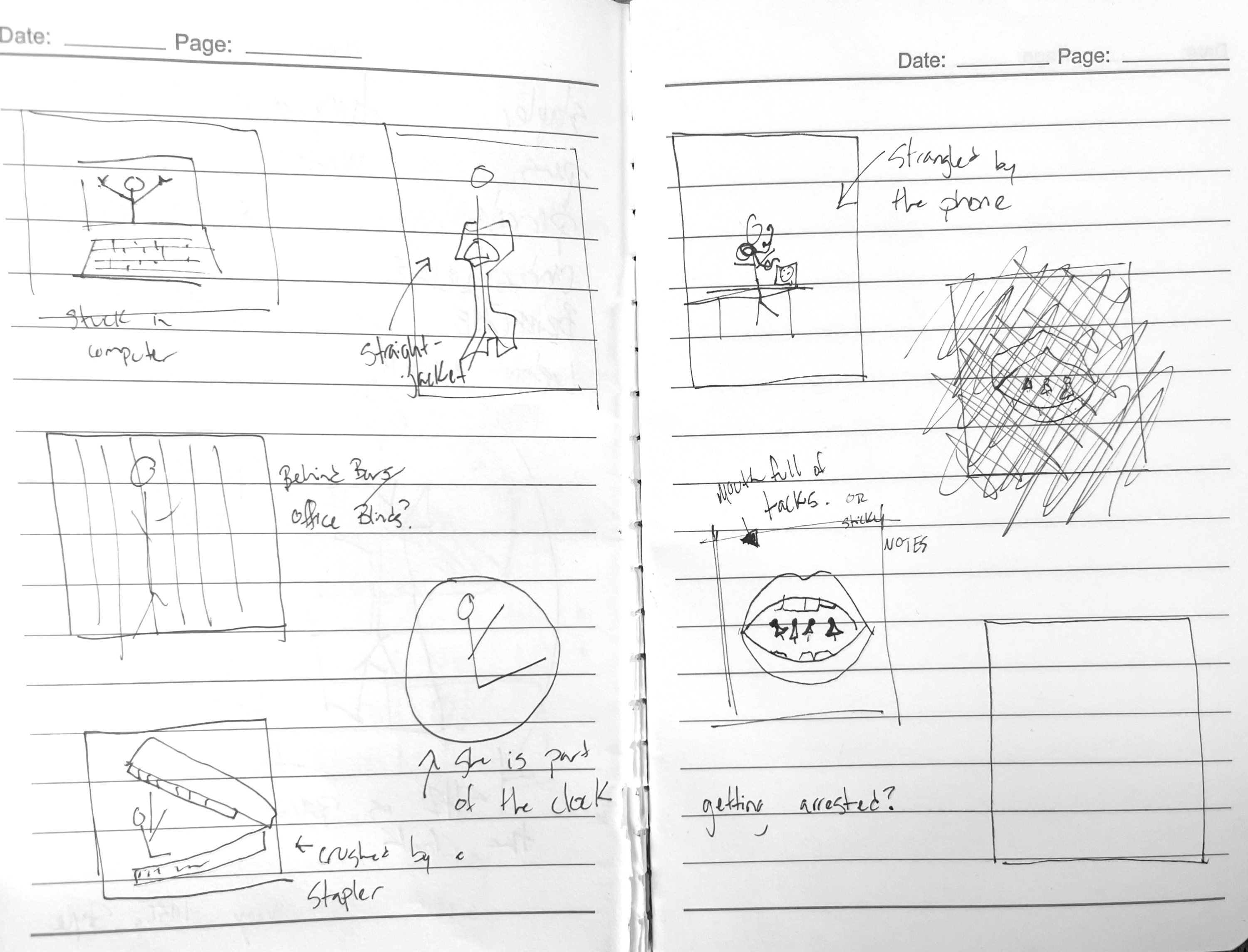
For the final project in my photography class, I knew I wanted to create a spread for GLITCH magazine, a publication that feels like a passionate side project for me. I decided early on to set the photoshoot in an office environment but needed to clarify my perspective. After some brainstorming, I landed on the theme of “work as jail,” a concept that explores the restrictive nature of office culture. From there, I began listing office-themed props—like laptops, timecards, and staplers—that could enhance the narrative. To solidify the vision, I sketched out a storyboard of images, mapping out key shots that would guide the direction of the shoot and ensure a cohesive visual story.

Project Pitch

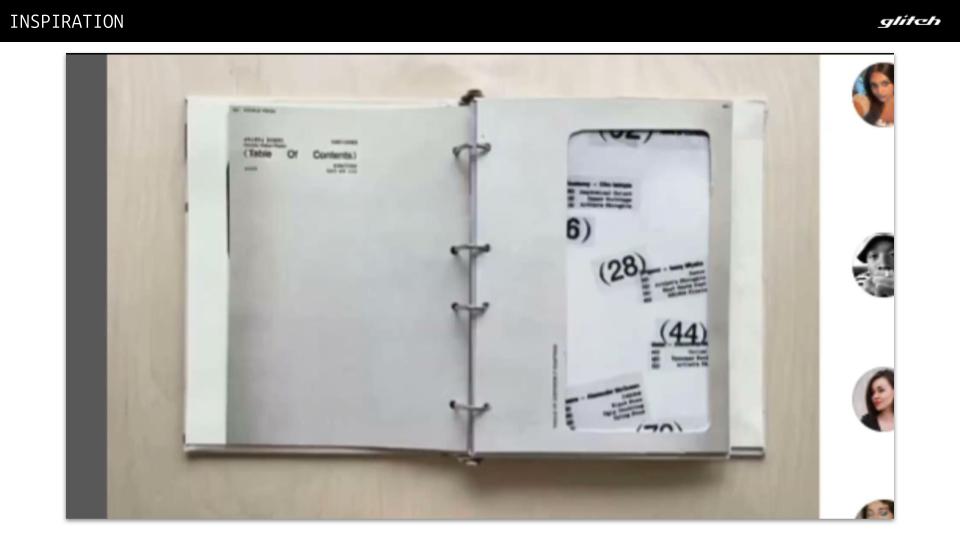
After refining my initial concept, I prepared a project pitch to present to my photography class. This included a mood board to convey the visual direction and a detailed timeline outlining my plan for executing the project.

Creative Brief

With my project approved and concept finalized, I created a detailed creative brief to ensure my deliverables met the objectives. To give the project a sense of real-world application, I approached the brief as if I were a freelance photographer pitching my concept to GLITCH magazine. I selected OMNES, a fashion line that I felt closely aligned with GLITCH's mission and values, as the focus for the editorial spread.

Test, Print, Repeat

I spent a lot of time in the campus printing room troubleshooting the printer and conducting multiple test prints to achieve the desired outcome. This involved making adjustments, reprinting, and retesting to ensure the quality met expectations. I also created prototypes of the binder and notebook covers to double-check and refine my measurements. This careful and iterative process ensured the final designs were both accurate and polished.

I spent a lot of time in the campus printing room troubleshooting the printer and conducting multiple test prints to achieve the desired outcome. This involved making adjustments, reprinting, and retesting to ensure the quality met expectations. I also created prototypes of the binder and notebook covers to double-check and refine my measurements. This careful and iterative process ensured the final designs were both accurate and polished.

CONNECT

2026 NOAH WOODRING

CONNECT

2026 NOAH WOODRING