


HISTORICIZE
Information Design
Motion Design
This project began as an educational reference poster designed for middle and high school history classrooms, focusing on the 2008 Housing Crisis. The goal was to visually narrate this pivotal event by clearly communicating its causes, effects, and lasting impact on society. To create a language that felt distinctly financial, I drew inspiration from the bold, dynamic visuals of editorial article thumbnails by Ben Kothe and Ryan Haskins, using collage techniques to reflect the complexity and fragmentation of the housing market collapse.
Building on the poster, I developed a three-minute explainer-style video that translates the static visuals into motion. Using the poster’s symbols, layouts, and data cues as a foundation, the video breaks down complex financial concepts into clear, engaging sequences inspired by popular educational explainer videos. Together, the poster and video create a cohesive learning system that balances research, visual storytelling, and accessibility, helping students better understand the chaos and consequences of the 2008 Housing Crisis.


THE PROCESS
Sketches


Sketching was a really important part of this project. I started out with some initial sketches, but after I realized those weren't working, I returned to my sketchbook to quickly figure out the best layout. Spending a few minutes to think about my layout of paper helped me solve my issues, and the final sketch is almost the final poster exactly. During the storyboarding process, brain-dumping my thougts for each frame/transition helped me stay organized.
Storyboarding
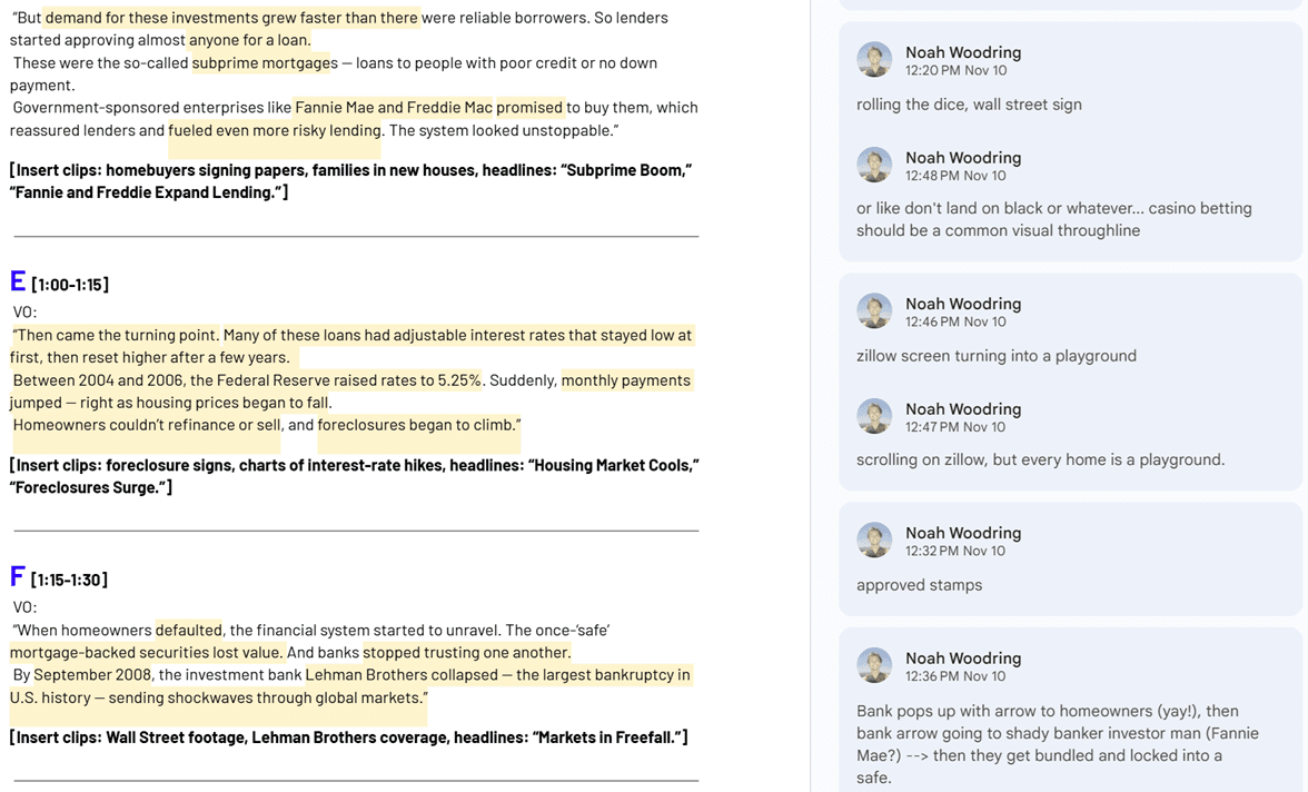
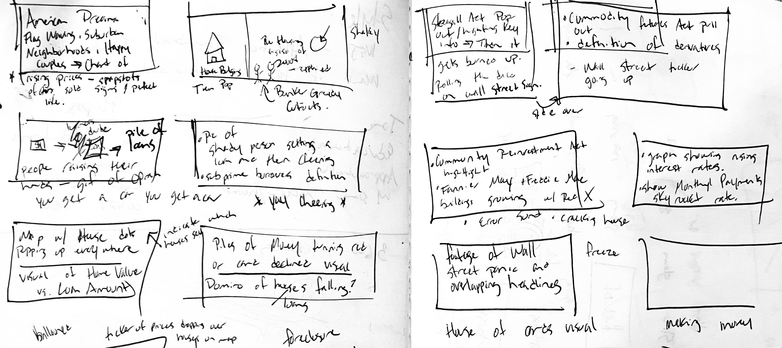
The same approach carried into the storyboarding process. I used my sketchbook to brain-dump ideas for each frame and transition, which helped me stay organized. By breaking the script into scenes, I could map out how each line would play out visually and how the transitions would connect, making the animation process much smoother.
Iterations


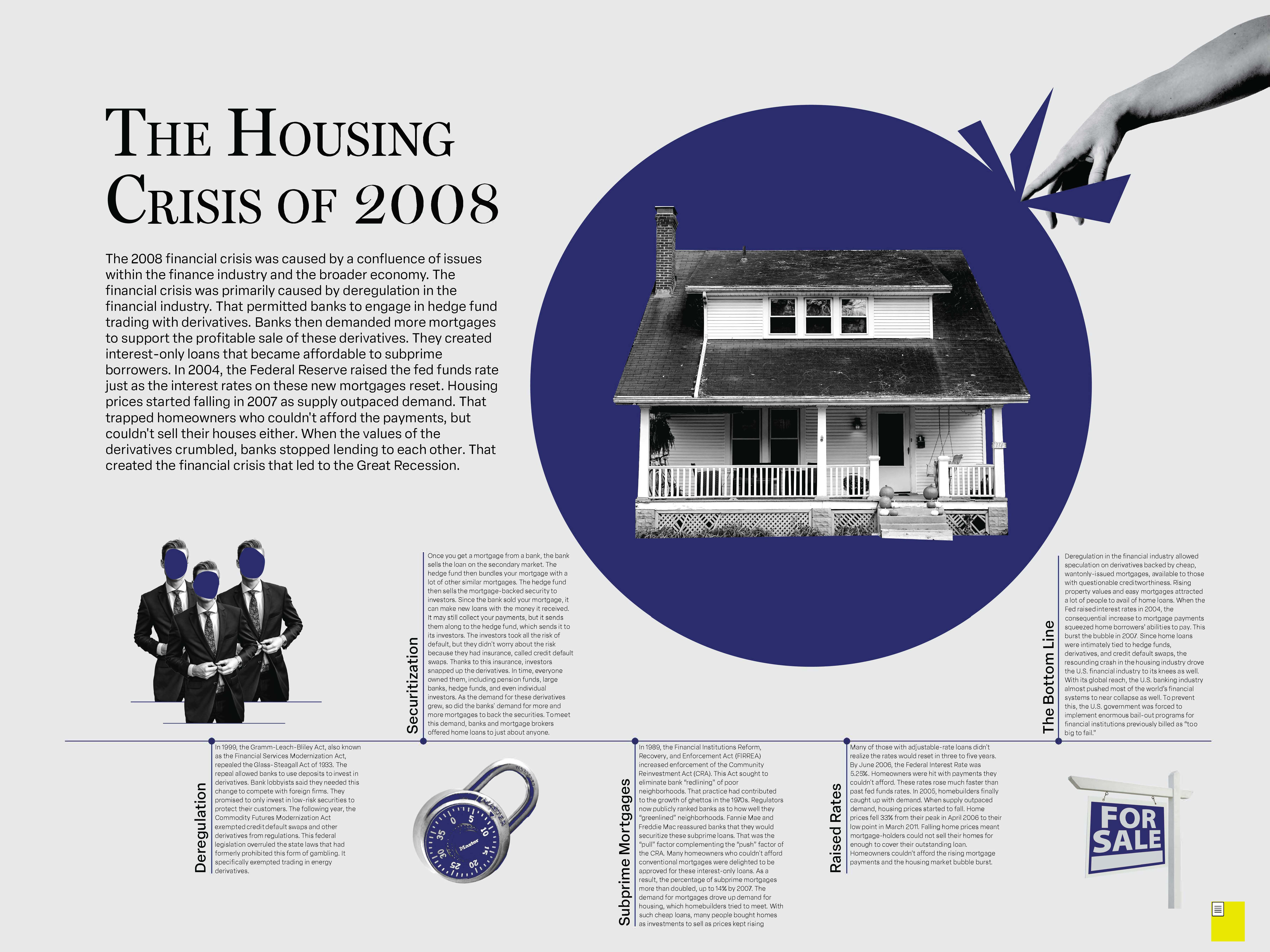

I began this project right before leaving on a trip, so my initial goal was simply to get the idea down on paper so I would remember my thinking when I returned. Once the first version was finalized, I focused the next iterations on decluttering the composition, improving type size and readability, and making sure the bubble clearly read as a strong visual pop.